KJ
Collaborative Online International (COIL) Project
Overview
This collaborative project centers on two influential figures: KAJENG WONG (KJ) from Hong Kong and Bobbie Clarke from Coventry. Our goal is to create exhibition posters that celebrate these artists and illuminate their connections, with my focus being on the KJ poster.
Our designs are inspired by both classical and rock music, highlighting the powerful melodies conveyed through rhythm and tempo. Distorted typography mirrors their shared musical elements, while a black-and-white color palette embodies the essence of both genres.
Work at
2022 BA (Hons) Graphic Design
Industry
Music
Role
Graphic Design
Tools
Illustrator, Photoshop
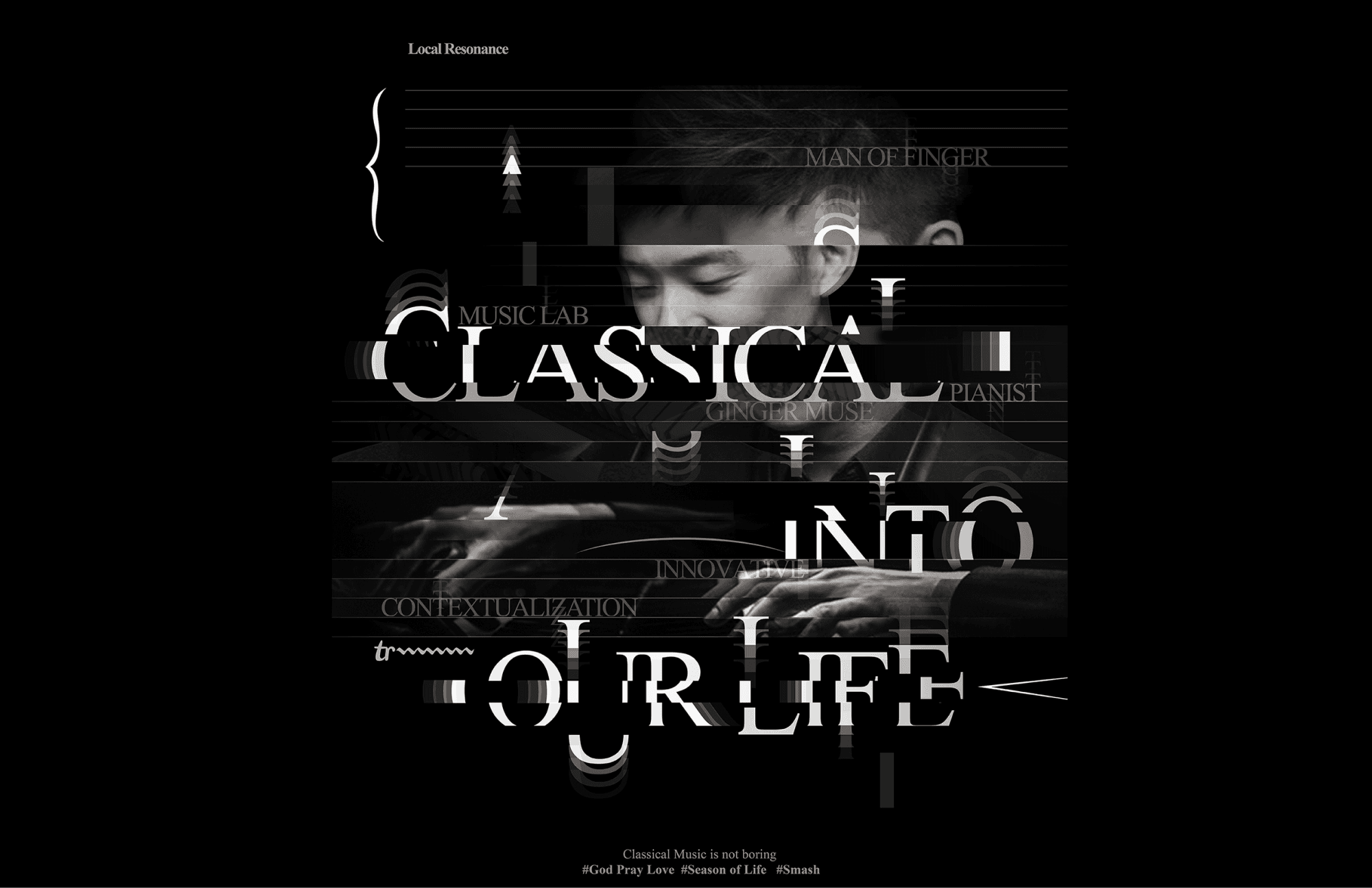


Classical music commands attention with its use of tempo and rhythm, and a good rock song does the exact same thing. To communicate Clarke’s and Wong’s dependence on strong melodies, we have used distorted typography. To highlight
both rock n’ roll and the classic vibe, we decided to maintain a black and white colour palette. The music sheet is used to illustrate the abstract sounds so the piece can be universally understood.
古典音樂和搖滾歌曲同樣透過節拍和旋律來引起大眾的注意。我們透過分割及扭曲字體的結構,來傳達 Bobbie Clarke 和黃家正 (KJ) 對樂曲所注入的強烈信息和感覺。 黑白色調象徵早期美國搖滾樂和古典音樂的悠久歷史。 而樂譜的呈現是代表他們把抽象的聲音,轉化為大眾可產生共鳴的作品。
PORTFOLIO
CHECK OUT SOME MORE

Save the Arctic
Save the Arctic
Save the Arctic
-
Typography
Save the Arctic
Save the Arctic
Save the Arctic
-
Typography
Save the Arctic
Save the Arctic
Save the Arctic
Save the Arctic
Save the Arctic
Save the Arctic
-
Typography
HAVE A PROJECT IN MIND ?
